Skills & Tools
User Research, Ideation, Prototyping, A/B testing, Variables and Components
Expected Results
Enhanced community engagement and student retentation, addressing pain points,
Responsibilities:
User interface and User experience design, Usability testing
Duration:
1 month

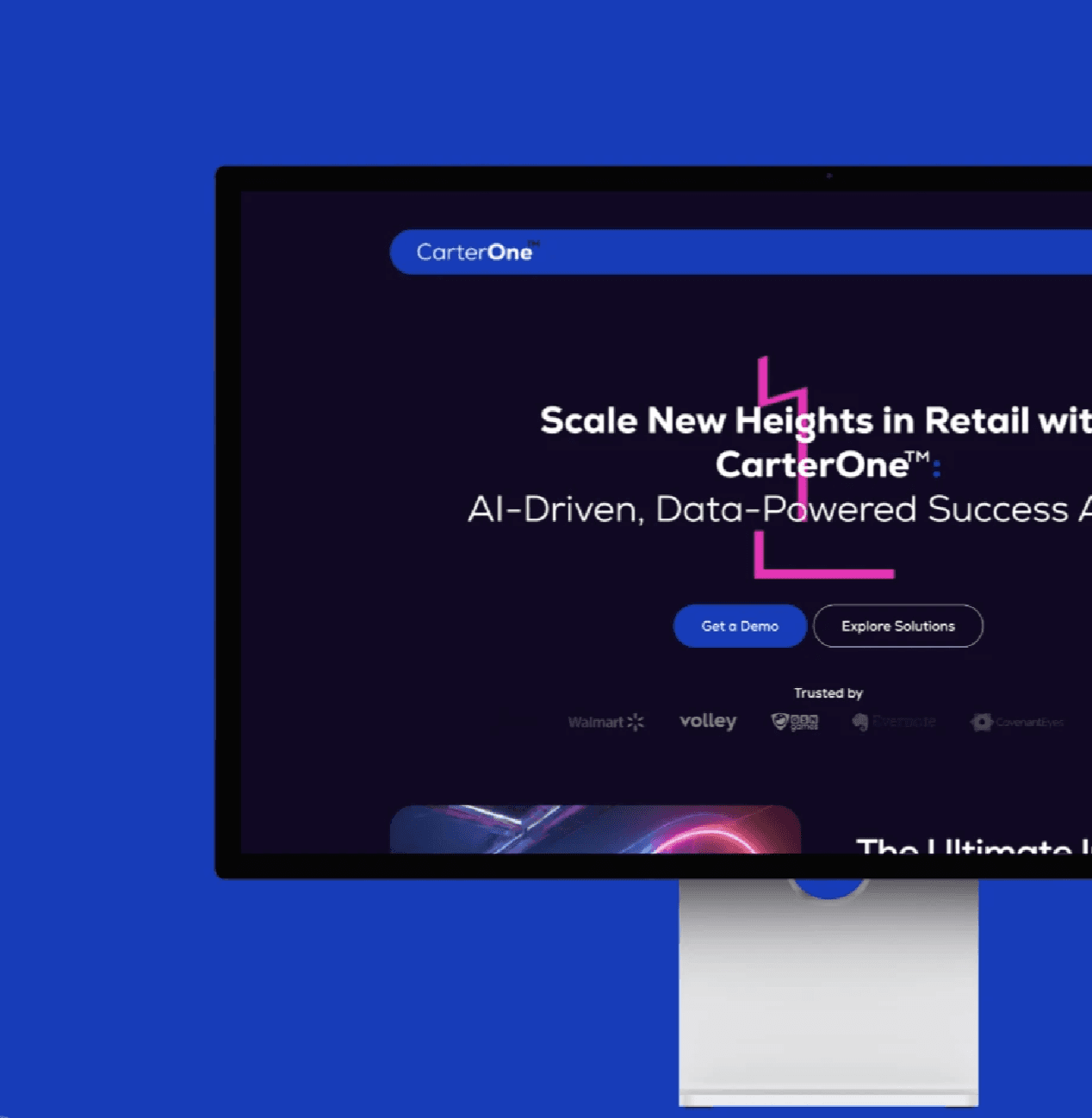
A Unified Platform for University Students

One of the core requested features of Studypall was the “Discussion Forum for students to ask questions and share experiences.” This feature was designed to tackle the problem of students feeling disconnected and unsupported during their academic journey. The goal was to create an engaging, user-friendly forum that would encourage meaningful interactions and provide a reliable support network.
Finding the "Why"
Defining the audience

Understand user’s context and needs

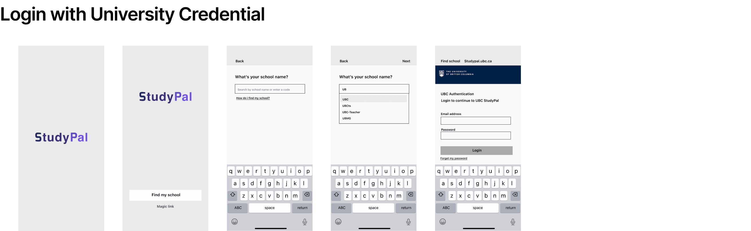
Low-fidelity Wireframes
This is a simplified version of accessing the discussion forum from the login process. It was created after some hand sketching, with a focus on functionality rather than visual design.

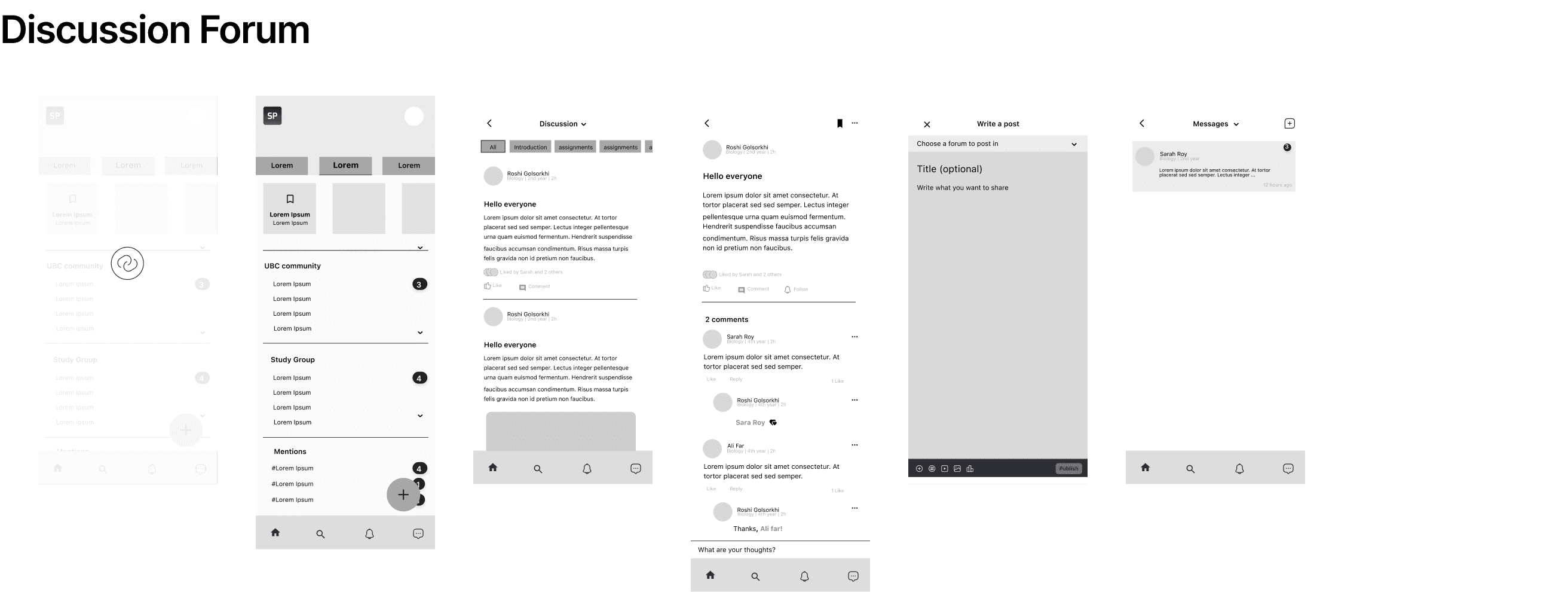
This set of mockups represents the final version of a user interface designed for the "Discussion Forum" feature of the app. The design has been iteratively refined through several rounds of usability testing to ensure it meets the needs and expectations of the target audience.
#Challenge 1: "Balancing simplicity and functionality for the primary feature"
I’ve faced challenges in ensuring the app is user-friendly while incorporating diverse features like posts, forums, and attachments. My approach was to prioritize the most important features, categorize them, and maintain a clean interface. I adopted a minimalist design with minimal use of colors, focusing on essential elements and providing easy access to the actions most needed by users. This strategy helped keep the user experience straightforward and intuitive.
Catering to a wide range of users with varying technical skills and needs, particularly in a community-based app, I conducted user testing sessions with diverse groups to gather feedback and better understand different user perspectives. To serve people with different levels of ability, I made sure to incorporate accessibility features, such as high-contrast colors and screen reader support, to accommodate all users.

I’ve ensured an intuitive navigation system that makes it easy for users to find sections like community updates and discussion threads. Key features like “Threads” are prominently placed for easy access. I’ve used consistent icons, colors, and fonts to create a cohesive experience, with clear visual cues for interactive elements. High-contrast colors and ample spacing ensure accessibility and readability for all users.
#Challenge 2: "Facilitating user engagement and interaction while accommodating varying content types"
The challenge I faced was designing threads that encourage user engagement and participation in discussions, which is a critical aspect of a community-based app. I focused on prominently highlighting active discussions and popular posts within the app, using visual cues to draw user attention and encourage further exploration. By showcasing trending topics in specific categories, I aimed to create a more dynamic and engaging environment, encouraging users to become more involved and contribute to the community.
I’ve had to manage integrating different content types, including text, images, and links, within a single interface. To solve this, I developed flexible content blocks that can accommodate various media formats, allowing the layout to adjust to different combinations of content smoothly. Additionally, I aimed to design an interface that could grow and adapt as the app developed and new features were introduced. I adopted a modular design strategy, which allows for easy addition, removal, or customization of components without affecting the overall layout. Throughout this process, I conducted usability testing to gather feedback and ensured the design was user-friendly and intuitive, making adjustments based on user insights.
I’ve included prominent category tabs like “All,” “Open AI,” and “Introduction,” highlighting the current hot topics with active people. I’ve organized user posts with profile pictures, usernames, brief bios, and content previews, along with clear engagement metrics like likes and comments to encourage interaction. The bottom navigation bar offers quick access to essential features like “Home” and “Search,”. Overall, I ensured the design is easy to navigate, promotes user engagement, maintains clarity, provides immediate feedback, and is accessible with clear text and high-contrast elements.
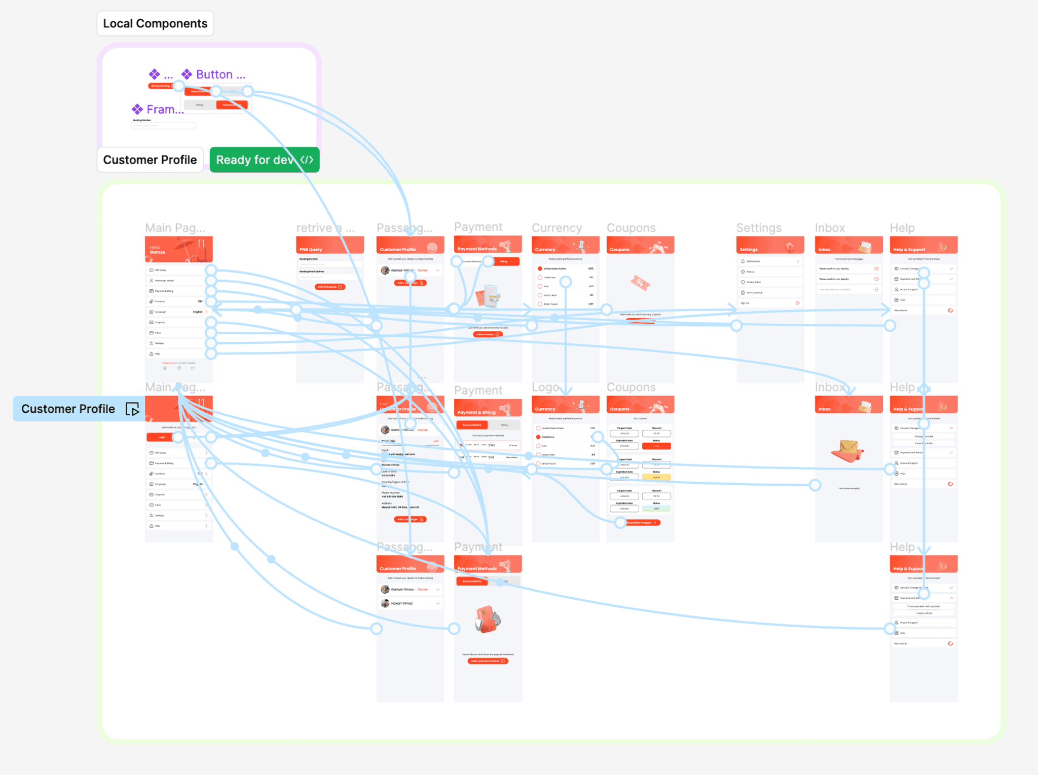
In shaping Lomio, we integrated an interactive design system with reusable components that streamlined our prototyping process. This approach enabled the rapid and consistent creation of prototypes that matched our brand identity, simplified the move from design to development, and flexibly accommodated our product's evolving requirements.
This platform and its expansion into MyTravel showcase the remarkable outcomes of combining visionary design with strategic execution. As a living, evolving entity, Lomio invites users to a new way of experiencing travel planning, emphasizing ease and enjoyment.


Creating Lomio has been a highlight of my career, challenging my design abilities, teaching me about product development, and highlighting the importance of understanding users' needs. The process, from naming the product to seeing our concepts become digital reality, has been full of learning about innovation, teamwork, and dedication. Watching Lomio succeed and expanding our efforts to MyTravel has been incredibly fulfilling. These projects prove the success of combining clear vision with detailed design and careful planning. They are continuously improving and inviting users to try a new way of planning their travels. We encourage everyone to try out Lomio and provide feedback on MVP 2 in our test environment. Your insights are crucial for improving this platform and making travel planning a seamless experience. Join us in this endeavor to transform how the world plans travel.